
Go big or go home.
Ask:
Epson wanted a display for their projectors to be featured in Costco. As you can see in this picture, they do sell some of their printers but the impact isn’t there. You can hardly tell the difference between their little shelf display and the competitors down the line.
Challenges:
Design something with impact.
Feature two products in each bay in such a way to compare the two.
Have a headline and product information somewhere
Shaq MUST be included.
Think about best use of space and visual constraints.
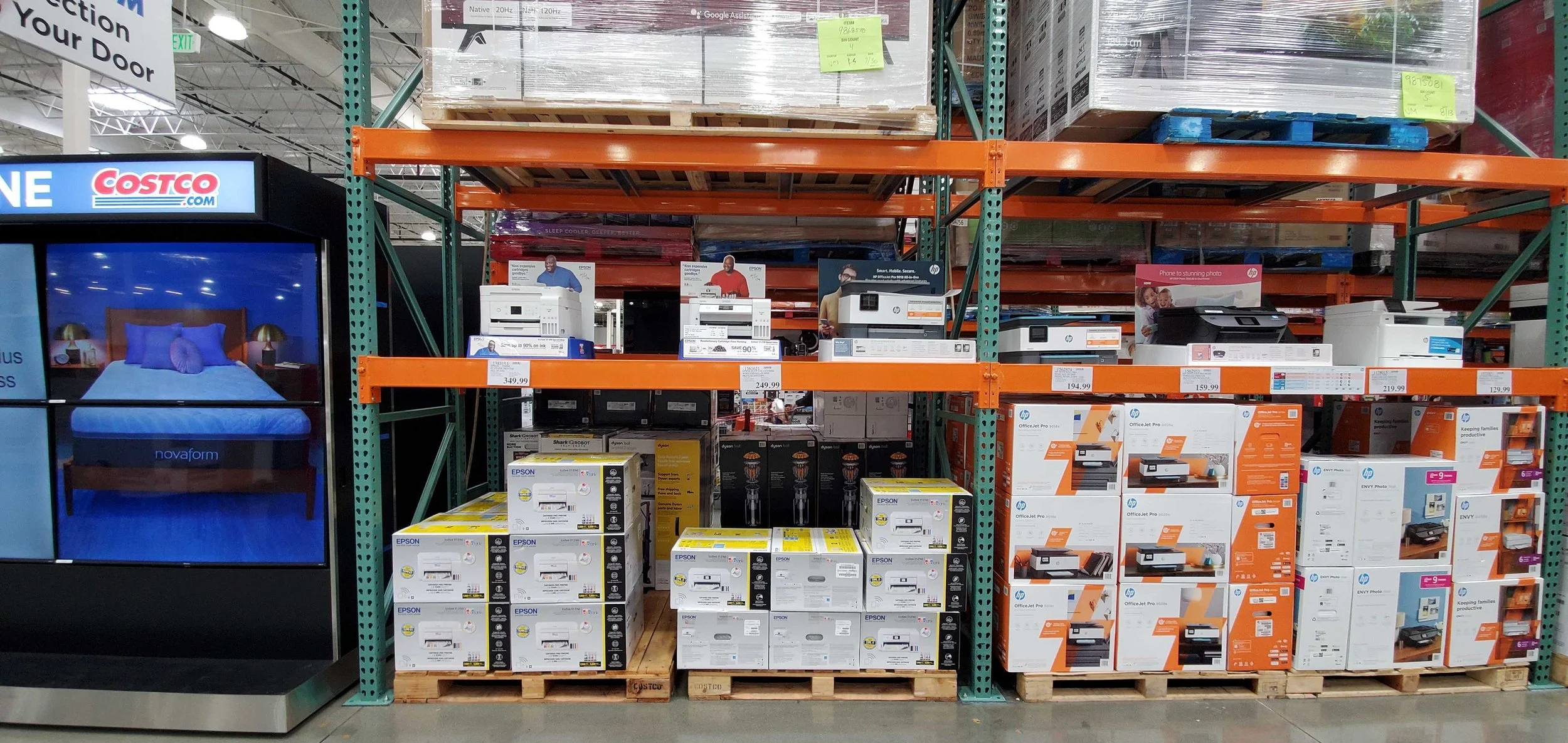
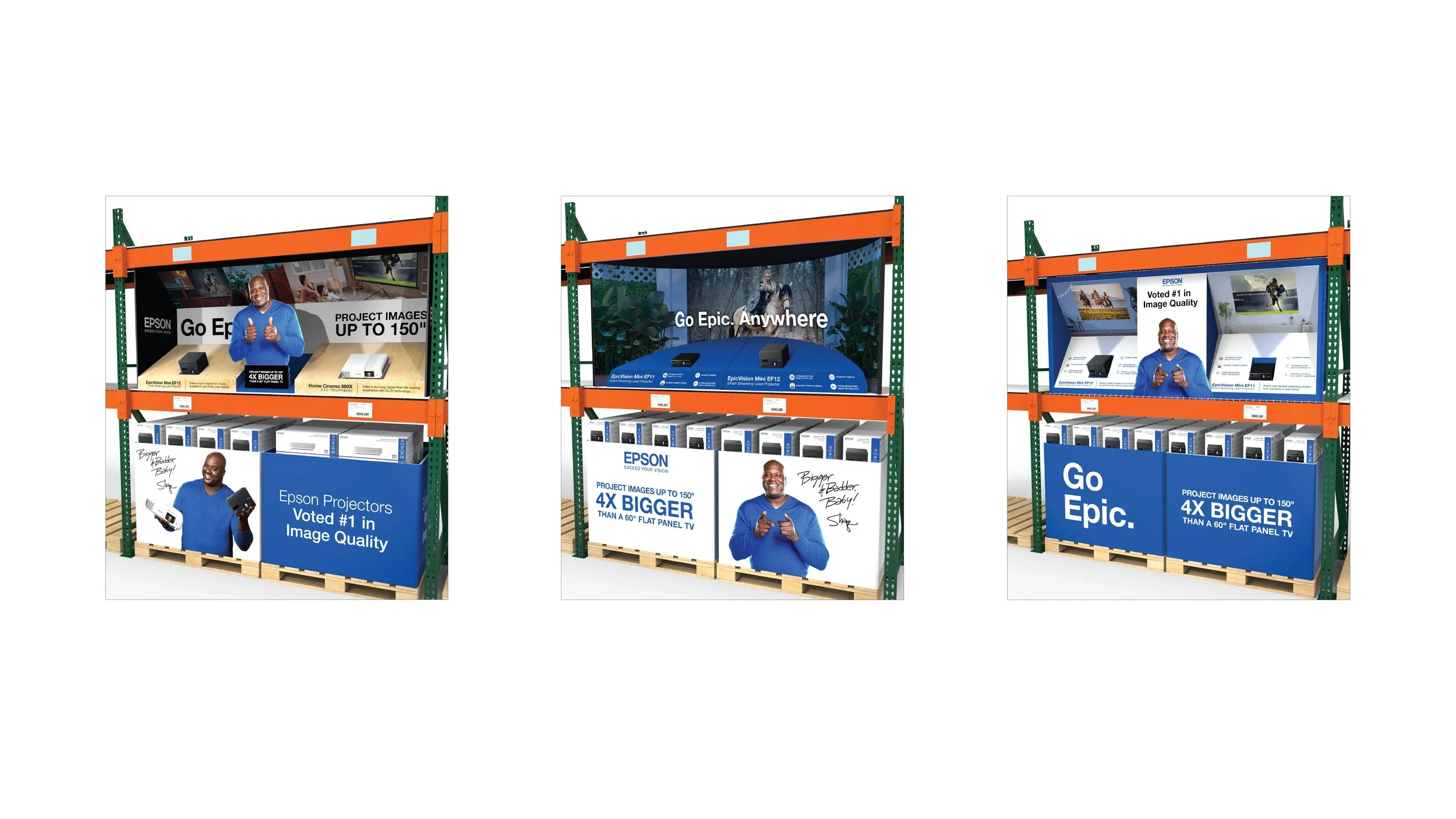
Epson printers featured on the far left, sharing the space with competitors.
Solution:
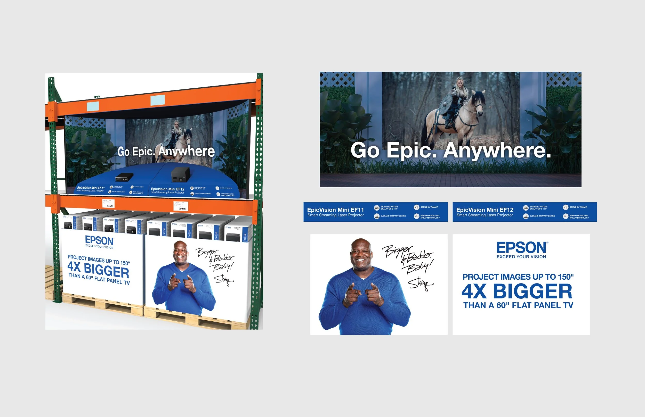
In regards to visual restraints, if you’re a short person like me (i’m 5’3”) your eye line is where the lower orange bar is. The graphic space is fairly limited. Any important product messaging would have to go on the front panel and tag lines relegated to the upper part behind the product (as seen above).
Working in tandem with a 3D designer, we brainstormed how we could structure the space in such a way to have more space for product information and also have a wow factor to attract shoppers. The solution we came up with was to take up the whole space from top to bottom. Each version utilizes the pallet wrap on the product boxes and vertical or slanted shapes to add imagery and product info above. For the graphics, I wanted to give the illusion of the product being “in-situation”, highlighting the compact size and portability of each product.
More details below!
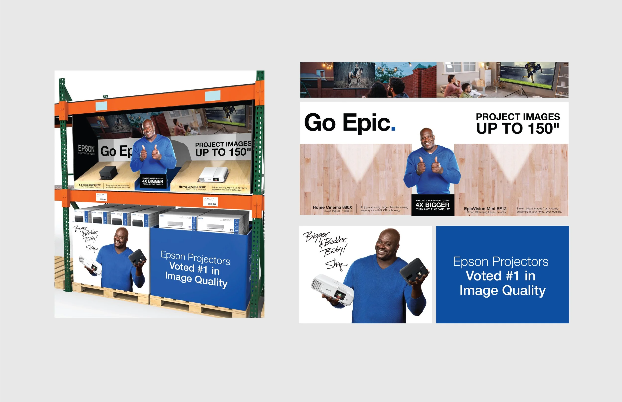
This option features top and bottom angled spaces leading towards a back wall of large tag lines. Product info is featured right at the front and low enough for people of any height to be able to read clearly while any larger tagline could be towards the back. The images features portability of the projectors showing one “projecting” outside and on the inside. This version also features two Shaq’s. They loved that.
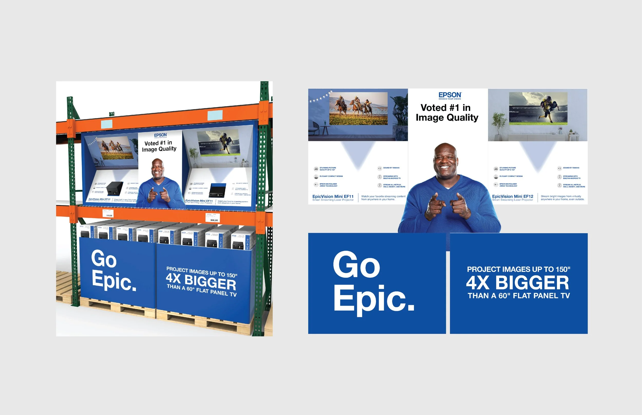
This option has a rectangular shape with panels on both sides at a roughly 60 degree angle. This allows for more space for lifestyle imagery and product info since the degree of the slant being almost upright makes it legible for anyone of any height. Taglines can also be featured extra large on the bottom pallet wraps and a cutout of Shaq remains front and center.
The thinking behind the curved backer was for people walking down the aisle being able to see this big bold messaging from afar and going in for a closer look.