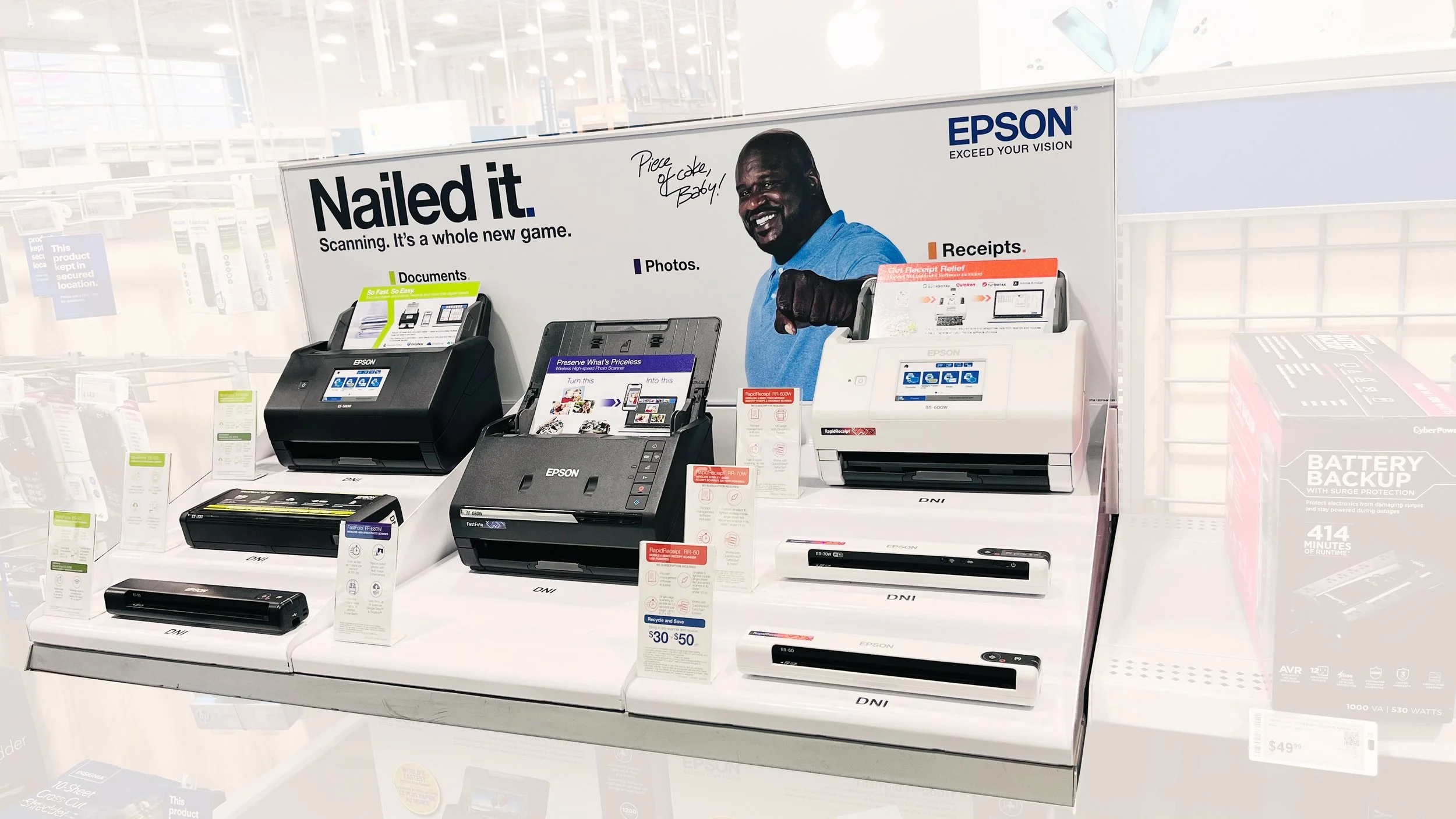
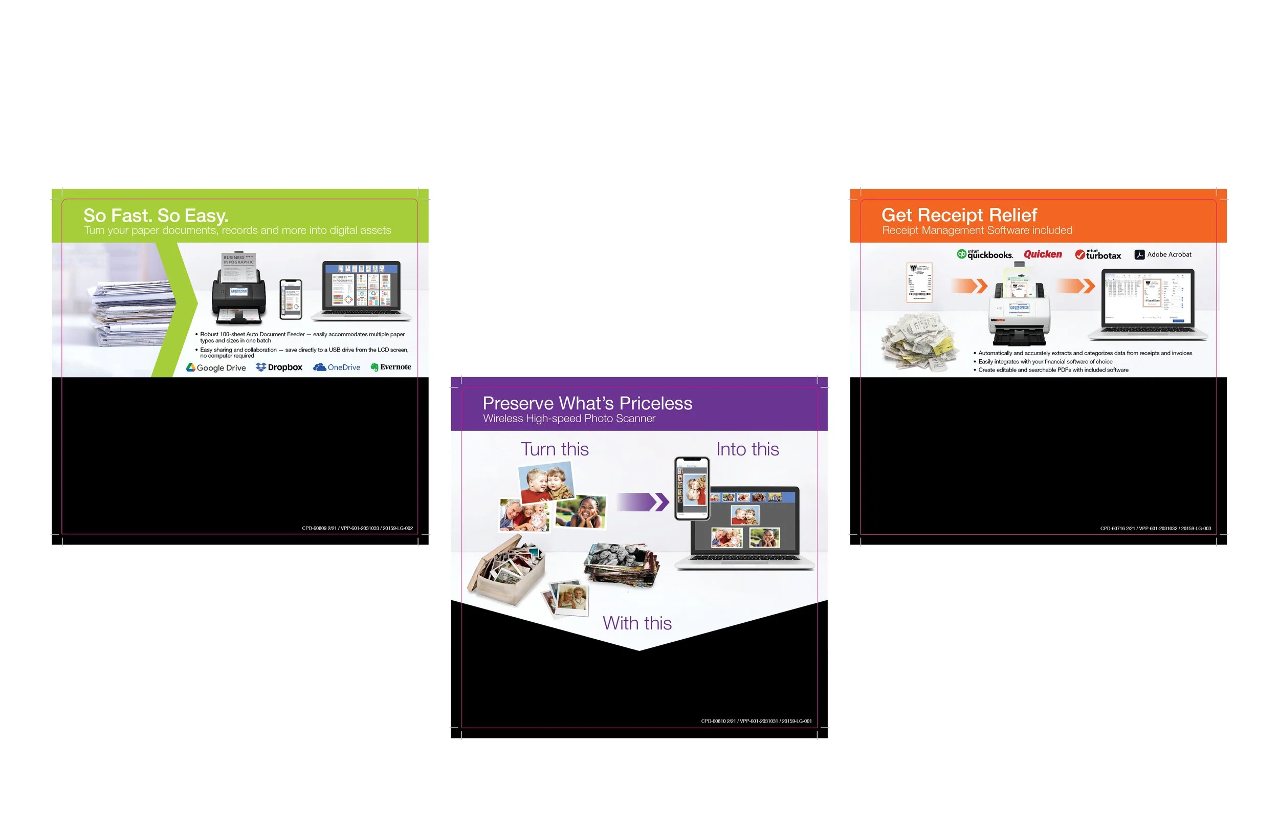
Create a family.
Ask:
Create two more inserts to match the existing purple one and also update information.
Challenge:
Make all three of them look like a family with similar graphic elements.
More elements were needed for the Orange and Green ones.
Space was also smaller than on the original purple one.
Solution:
Keep the banner size and copy the same across all three and use the same graphic formula showing the problem and the solution in the space. For the orange and green ones i made the added logos and bullet sizes the same to show consistency.
All three of these were laid out in InDesign but the images were put together in Photoshop. Some of the graphics were provided, like the images of the scanners, laptop and the logos, but everything else I found in Adobe stock images.
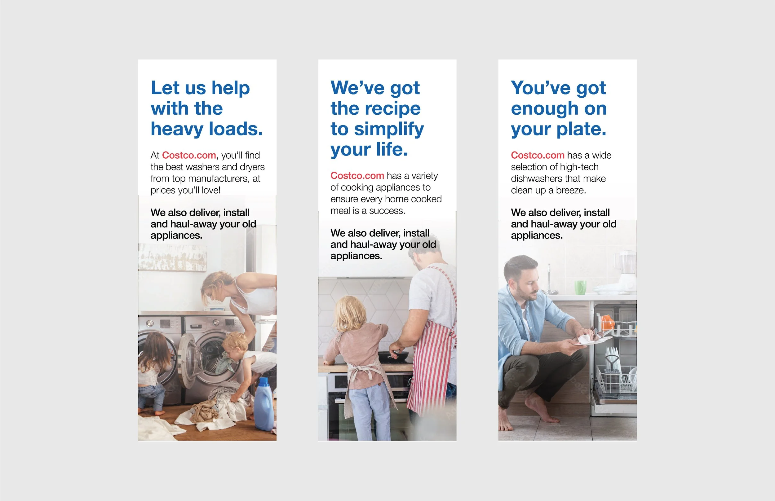
We’re here to help.
Ask:
They wanted banners to draw attention to their appliance deals.
Challenge:
Something eye-catching to make people look up.
Fun messaging with lifestyle image
Solution:
My idea was to come up with a catchy tagline for different heavily used appliances and have a corresponding image below it. My only wish was that I was able to find a more diverse set of images. I do like that i added men doing some household chores but wish i could have found more culturally diverse sets of people. But it can be difficult to find images that fit within spaces that also work for the concept you’re going for.
The hierarchy is clear and concise on the banners. The largest bold blue copy draws the eye first and gives the message of “let us help”. Then your eyes go to Costco.com in red, directing you to their website to browse and purchase. Lastly, the bold message at the bottom is “here’s how we can help”.